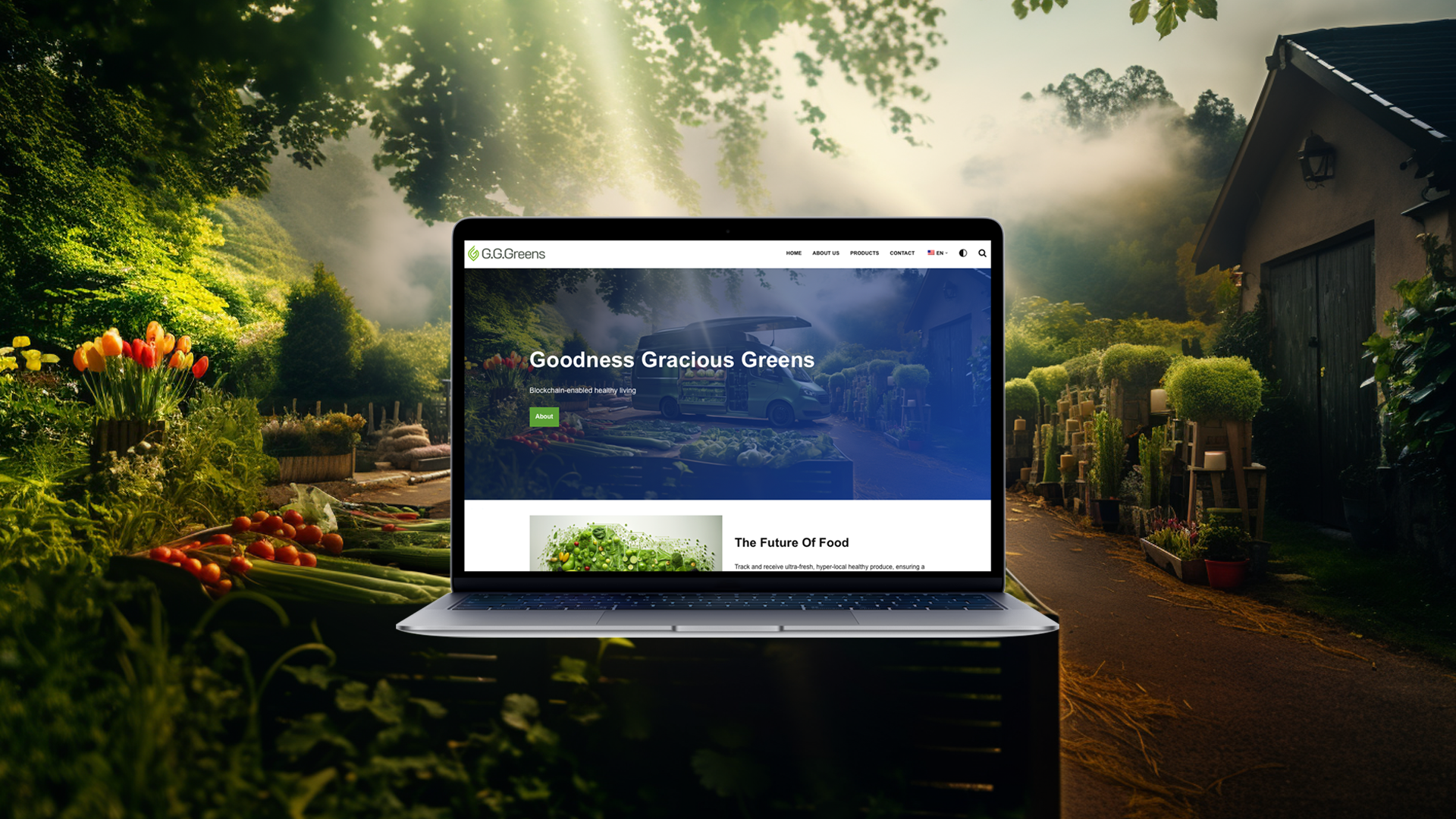
Founded in 2022, G.G.Greens (Goodness Gracious Greens) is a blockchain startup that implements a digitally optimised two-sided marketplace to help people access and consume locally grown produce. G.G.Greens wanted to create a contemporary and slick brand that would work seamlessly across digital platforms and resonate with environmentally- and health-conscious and consumers. Together, we crafted and implemented the verbal and visual identity, along with the art direction, culminating in the creation of a comprehensive website.


Brand development
Web development
Web maintenance
Web text and graphics

G.G.Greens’ logo embodies simplicity and contemporary flair. The design features a green leaf shape, symbolising the company’s commitment to sustainability, with the leaf composed of two interlocking letter Gs, mirroring the initials of the company name. The the bold icon and capital Gs exude confidence and make a strong statement, perfectly aligning with the dynamic nature of the tech sector, while the curvy font and lowercase letters in ‘reens’ infuse the design with warmth and approachability, fostering a friendly connection with the audience.
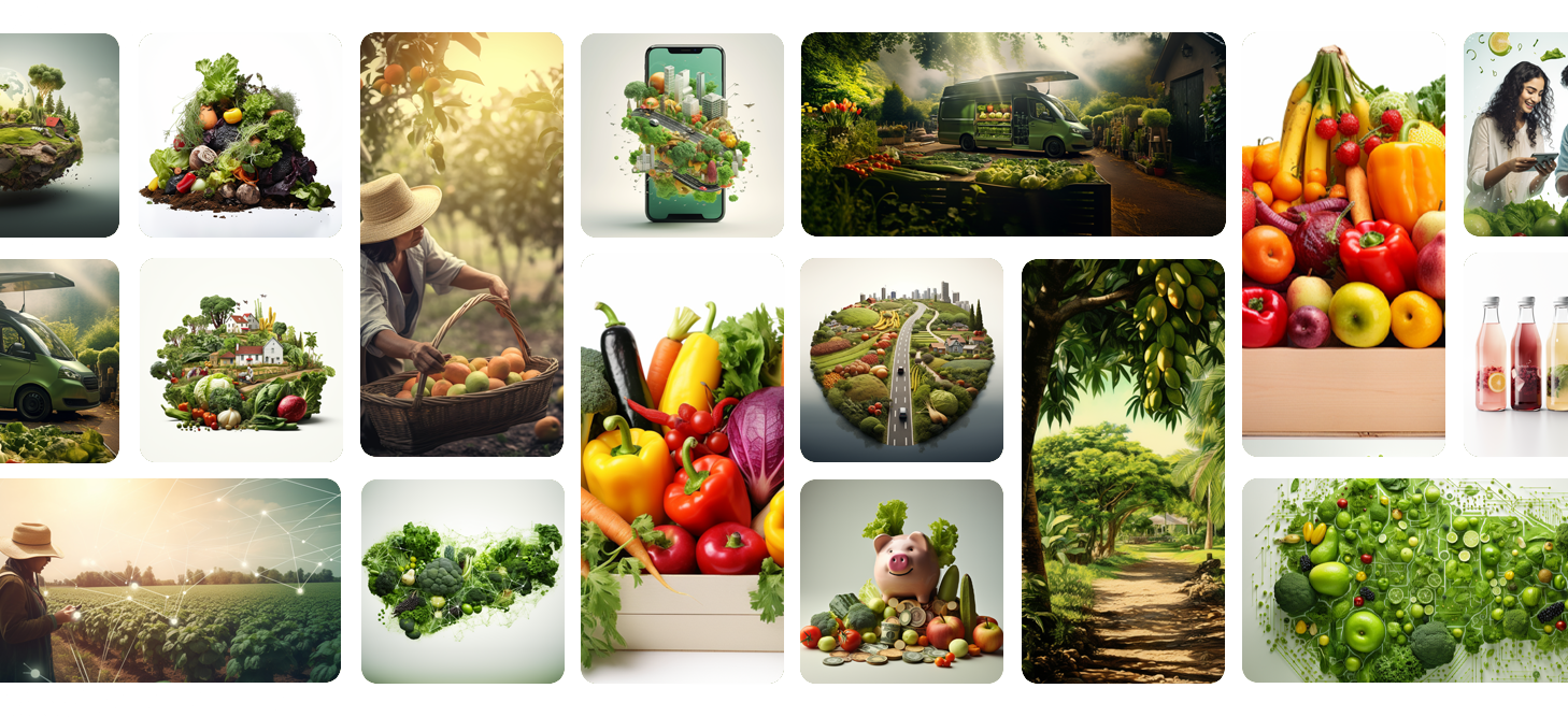
The website offers valuable insights into the innovative technology driving G.G.Greens, showcasing its range of products, and highlighting the company’s strong eco-conscious credentials. It employs a lush green color palette throughout, creating a harmonious visual experience for visitors. Original graphics further enhance the site’s appeal, capturing the essence of G.G.Greens’ commitment to sustainability and innovation. Additionally, the website features a language toggle, allowing users to seamlessly switch between American English and Puerto Rican Spanish, catering to the company’s diverse audience and enhancing accessibility.

The graphics communicate the brand’s values, offerings, and commitment to revolutionising the way consumers access fresh, locally sourced produce. They exude a sense of fresh, modern sophistication while staying true to G.G.Greens’ identity. Predominantly green hues dominate the colour scheme, seamlessly tying into the brand’s colours and symbolising growth, vitality, and the agricultural focus of the company. Clean and minimalist design elements enhance the user experience, ensuring that the focus remains on the content and message.
On-site elements have been tweaked and optimised based on a search audit. This includes refining meta tags, enhancing internal linking structures, and optimising content by incorporating targeted keywords throughout.

Let’s bring your digital vision to life! Our team is ready to partner with you, crafting bespoke solutions tailored to your unique needs.

Unlocking Your Digital Success.
Copyright 2025 © All Rights Reserved